CE Axa-Im

Logo and style guide for the UES AXA-IM
Our studio Desjeux Créations designed the logo and style guide for the Comité d’Entreprise UES AXA-IM, a branch of AXA France.
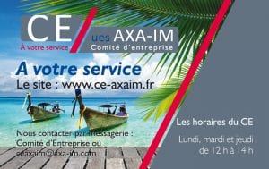
We also used the logo on business cards for AXA-IM staff. Our logo design was the result of several stages of brainstorming and planning in close partnership with the CE UES AXA-IM.
The outline below shows the process which was followed, both by AXA-IM and our design team, to achieve a meaningful design which met AXA-IM’s communication requirements.
Stage 1: THE BRIEF
Our Customer the works council EU AXA-IM needs following:
» We wish to improve the contact between the CE and the employees and to strengthen the visibility of the CE with the employees. » To answer this problem of image we wish to modify our existing logo.
The design schedules of a logotype (logo) which will then be declined on our various communications tools has to respect the following constraints:
– Answer the spirit of our IT: humanity, sharing, cultural, escape, discovery, journey, user-friendliness
– To respect the graphics standards of corporate AXA while allowing to identify clearly this AXA-IM must be respected as possible not to distort the relation between the CE and AXA-IM (even if they are 2 legally different entities).
Stage 2: ENVIRONMENT ANALYSIS
Hardly of this information our teams realize a study on the business sector of works councils: the competitors, the partners and the economic environment, to display the graphic choices of the latter. The objective of this « benchmarking » is to encircle better the image of the business sector of the CE to mark down better the CE EU AXA-IM and create a strong graphic identity. We also analyze the graphics standards corporate to take into account well the constraints and the environment schedules of our customers.
Stage 3: ROUGH SKETCHES
We realize a series of rough on paper to make sketches of the logo of AXA-IM. This stage allow us to define working tracks for the logo. We leave free court with our inspiration to realize numerous rough. From these drawings, we realize an analysis of the set, we eliminate one numbers of track and we keep the projects which seems to us relevant for the logo of AXA-IM.
Stage 4: CHOOSING THE TYPEFACE
There are several components in a logo (logotype), the typography is an important part. The research on the typographic choice has to correspond to the spirit of your company. The drawing of the letters of a font is going to influence on one hand the legibility of your logo, on the other hand the identity, the personality that it is going to may convey.
Every character, by its drawing and the attributes which we are going to give him, can clear or not a harmony with the spirit of your company. The typography brings an emotional charge and a particular atmosphere to the design.
Our work in this stage thus consists has to find a coherent typography with the graphic line of your company to get the attention of your targets and plunge them into your universe!
For AXA-IM we have to work on modern said typographies and the classics. (Classification Vox / AtypI).
Stage 5: CHOOSING THE COLOURS
Colors make sense, in synergy with the typography and the graphics of the logotype. At first studied by Newton in its chromatic circle, then by Goethe in the Analysis of colors, the question of the influence of colors on our person is a known fact.
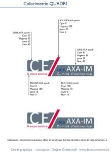
The choice of colors for your logotype is one vectors of graphic coherence, colors dictate numerous behavior to the unconscious of the men and the women. It generate reactions and feelings. We thus realize, with you, a search on the colors of your logo in connection with your activity, in mind of your know-how, to allow the logo to make sense. For the logo AXA-IM we worked around the colors of the group France to respect the existing graphics design.
Sense of the colors vary according to the codes cultural and member of a religious order of the countries of the whole world. It is important to dread well this sense not to make odd on your image. We accompany you in this creative approach of your logo.
Stage 6: CHOOSING THE GRAPHICS (THE SHAPE OF THE LOGO)
That it is squared, round, in curve, with a drawing, a mascot, a pictogram, the design of your logo has to remain simple and uncluttered and make sense with regard to your activity and to the values of your company.
Our creativity expresses himself to create a logo in the simple forms. This simplicity of the design of the logo allows that it is easily memory and recognizable. In the first view the image of the logo has to be associated with your mark, service or produced.
For the CE EU AXA-IM we opted for a graphics of the right and regular logo to express the rigor and the seriousness of the CE and at the same time the letters and the opening of plans to express the escape and the user-friendliness of the CE.
Stage 7: PRESENTATION OF OUR GROUNDWORK
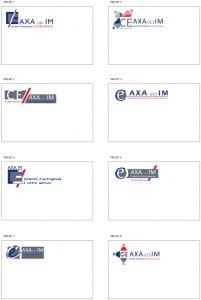
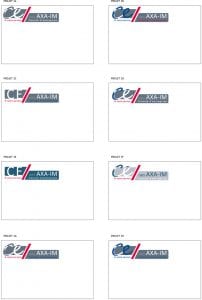
Once work was made further to our initial briefing and our creative reflection, we realize a board contact with various graphic projects to allow you to choose the colorimetric, typographic tracks and of shape which correspond to you.
The reflection and the exchange around our proposals are the key words of our work of creation of your logotype: this logo will be yours and will convey your image for a few years, thus we expect from you for comments and for remarks, to be able to finalize at best the creation of your logotype. This work of active listening and exchange is going to allow us after some round trips to finalize the graphics(handwriting) of your logo.
For AXA-IM here is the logo which was retained in the end.

Step 8 : THE BRAND IDENTITY OF THE LOGOTYPE
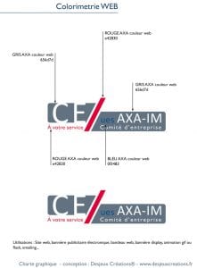
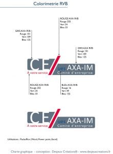
Once the logo has been finalised we’ll produce a style guide for it. This means explaining how it should be used on various supports (brochures, posters, websites, PowerPoint presentations, promotional objects, vehicle wraps, etc.). These details are part of creating your brand identity so that it is instantly recognisable.
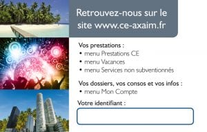
Here is the graphics Brand identity of the logo AXA-IM and its declension on a business card.
Contact us for your communication’s project communication, creation logo and publisnging
